
After reposting my 2013 piece on the low supply of doctors in the United States, I appealed to my readers to update my graphs. Peyton Lofton, a non-partisan policy analyst, answered the call. Here are the updated graphs, with Lofton’s commentary.
Good afternoon Dr. Caplan,
I hope you’re doing well and enjoying a restful holiday season. As a fan of your writing, I was glad to take up your recent invitation on Twitter to update the graphs about the ratio of new M.D.s to the population over time.
I’ve attached the updated graphs as images and included them below for reference. I aimed to replicate the original style while giving them a modernized look, but I’m happy to adjust the design if needed. Big picture: The ratio of M.D.s per capita is rising (good!) but not fast enough to counteract the growth of the senior population (bad!).
Observations:
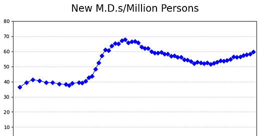
1. New M.D.s per million persons have actually ticked up over the last decade or so, but are still below the peak:
2. New male M.D.s are pretty flat still:
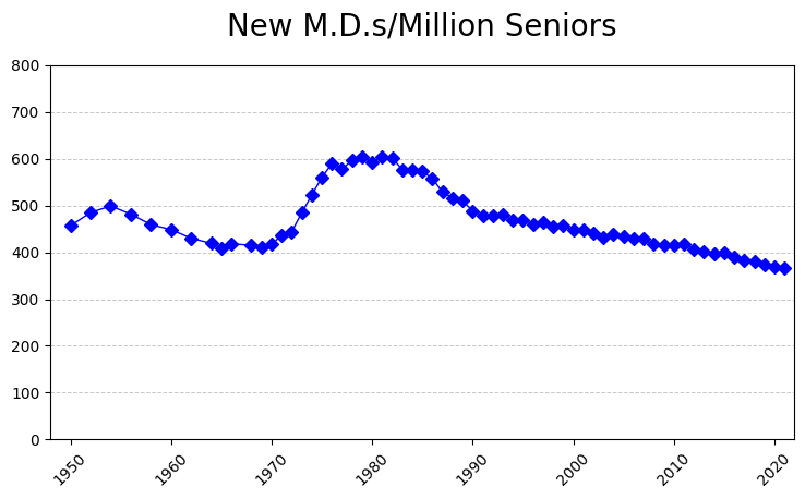
3. New M.D.s per million seniors continues to trend downward as our society ages. This is quite concerning:
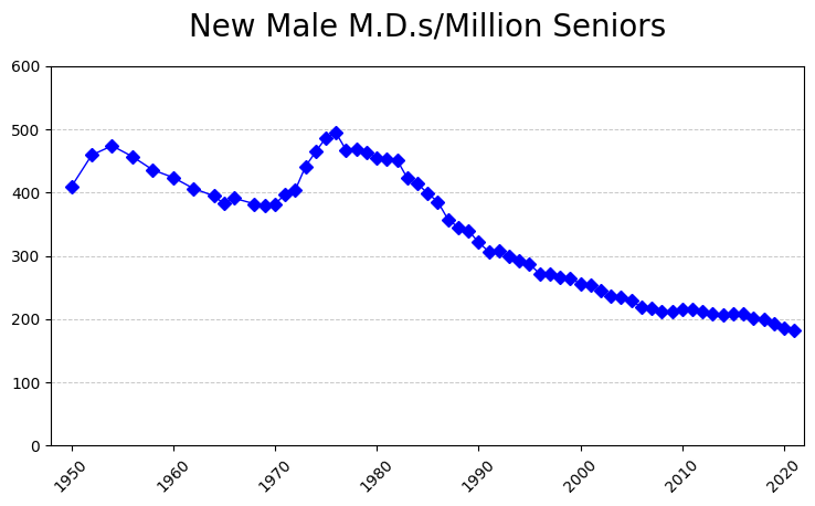
4. Similar trend happening with New male M.D.s per million seniors:
Best,
Peyton Lofton
Sources: For the data on M.D.s, I used the latest Digest of Education Statistics. For population data, I used Our World in Data [total population, senior population]. M.D. and population data are in the attached spreadsheet. The charts were made with Python.








Seems to ignore the increase in MD adjacent roles, like PAs and Nurse Practitioners which is an increase in supply of MD-like services. They can prescribe medicine, etc. Apologies in advance if this is covered elsewhere.
Why is it important to plot only new M.D.s? And how is "new" defined?